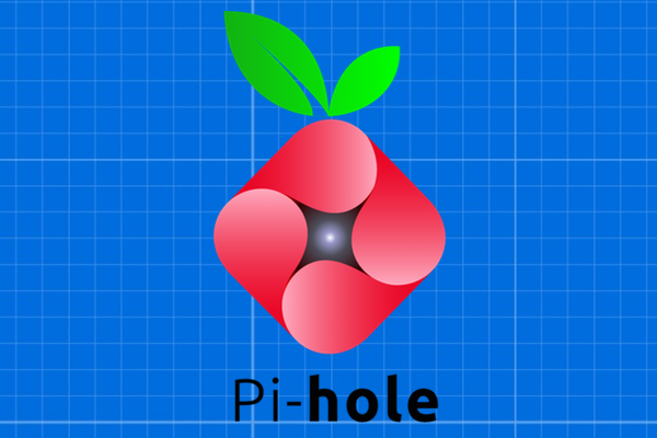
Our New Logo
We really like it and we think you’ll agree.
Legitimacy
Pi-hole has always been a community-driven project and we couldn’t have made it this far without all of you. In keeping with that spirit, we wanted our users to help us design and pick a new logo.
Unfortunately, the contest had some issues with legitimate voting as well as some other legal issues, so it didn’t go exactly as we hoped.
It’s partially our fault for not clearly laying out the rules of the contest and setting up a good voting system. In our defense, we all have full-time jobs and since the Raspberry Pi Foundation was hot on our tail, we wanted to get something going and involve the community.
Compromise
We think the logo above is a good compromise. It’s actually based off one of the entries, but we ended up making it from scratch so it’s completely ours.
Internally, everyone agreed that “Vortex” (as we refer to it internally) was the top choice when the submissions came in, so we spoke to the individual who submitted it and s/he was OK with us moving forward and making it our own.
19 Responses
Congratulations, I like it!
Congrats, you’ve finally got a new logo!
Although, unfortunately, the strength of it is gone after your adjustments. I liked this one very much in its original form. Hence, there are programmers and there are designers…
I totally agree. I also liked the color strength in the old one. In my humble opinion, having two representation of a “black hole” both visually and in text form (Hole) goes against the flow of simplicity. Similar to when lets say designing a logo of 3 arrows to represent a company called arrows and you also add the word “arrows” underneath the logo. I loved though the addition of a vane to the big leave.
Congratulations.
We’d like to see what you can do.
https://github.com/pi-hole/assets
Something like this, a different approach maintaining the original layout:
Thanks for the submission, I’ve modified is just a little and have a look for the FavIco / Reddit Flair possibilities. And might be a good one for the icons for our social media accounts where we just need a less busy look.
https://github.com/pi-hole/assets/pull/1/commits/4c6526b1d7a2b7e92a5e12c2939400b364cf6681
We’d like to see what you can do.
https://github.com/pi-hole/assets
BaBo is completely right about the folding over being better. I didn’t notice that aspect of it until they mentioned it and it really is better that way and makes it feel like you are falling into the center without the addition of the star point. I think you tried to cram too many things/concepts into the new logo and came out with a bad mixup that doesn’t really highlight any part of them. I do like the addition of the break in the large leaf but that is the only improvement.
Graphic Designer here, the original idea looked much better, specially the color tones on the gradient, now it makes no sense, there’s light where the shadow/darkness is supposed to be at, this makes the red thing not look like a one folded piece anymore. Also that line you added on a leaf, that wasn’t necessary, keep it simple, we know those are leaves, no need to add more detail to it. And that evil eye on the center, oh lord.
Also a freelance graphic designer, and although I didn’t like the original one, this one is much worse. The whole thing screams “1990s”, but thats okay. I would probably fail if I turned this into my graphic design professor. The line on the leaf and the hole in the center are so cringy. But it’s perfectly fine for a group this small. It’s kinda clever, anyways.
I have no humanly idea why they would ruin the original. Is it some sort of IP issue? “…but we ended up making it from scratch so it’s completely ours.” Huh? Changed the gradients to make no sense? Nice project, but why take on graphic design?
It is an IP issue actually. And we are working on integrating some of the comments here. If you’d like to help, there’s a repo at https://github.com/pi-hole/assets and we welcome any input.
terrible.. follow graphic designers advices instead.
Seriously guys, you should’ve sticked with the original. Even the sample below looks better than yours… I’m replacing the icon in the admin page.
We open-sourced the logo so the community can suggest improvements.
Maybe we all c.h.i.p. in and you hire one decent responsible graphics designer?
It’s getting from bad to worse; the contest idea was nice, the outcome was painful. Covering it up hasn’t been fruitful.
Building something wonderful together such as pi-hole, is an effort of people collaborating and testing into extent. Designing a logo is not something you can do in that same way, is my opinion.
Too much ‘non designers’ have a say, the result will be less …
Seriously guys, you should’ve sticked with the original. Even the sample below looks better than yours… I’m replacing the icon in the admin page.
Comments are closed.